Wednesday 25 November 2009

PRESTWICK ACADEMY, SOUTH AYRSHIRE BY RYDER ARCHITECTURAL

This is just deadly, isn't it? This is an academy, the pride of Britain's schools system. The academy programme has created a generation of buildings that by and large are made of render, in white and coloured panels, designed by terrible architects like Ryder who treat them like just another developer piece of shit.
Like this one, academies often have glassy atrims to try to look less forbidding and more democratic than Victorian schools, but usually end up looking like they should be on a low-rent business park somewhere in, er, Ayrshire.
I like to imagine what the conversation in the Ryder office was like when they chose where to put the yellow panels in the wing on the left hand side. 'No, a bit left.' 'Put three yellow bits in that one." "Move that one a bay to the right." "That's it! Perfect."
The public realm outside has been comprehensively galvanised, with only the bits of timber on the benches giving a hint of what might have been.

Tuesday 10 November 2009

MOUNTBATTEN LEISURE CENTRE, PORTSMOUTH BY SAUNDERS ARCHITECTS

Mountbatten Leisure Centre hosts many events every year, including Robot Wars. So when Saunders Architects got hold of the brief for this beauty, they decided to make a weird, wavy alpine roof with a giant piece of pipe smashed into it, in homage. It's basically an innocent wooden shed getting fucked by a giant robotic cock.
I know that you guys love the sections that architects like Saunders draw, so here it is - the 'concept drawing'.
Brilliant. It really 'emphasises the vibrant nature of the city of Portsmouth', to my eye.

Thursday 8 October 2009

PHOENIX PLACE, BASILDON, ESSEX BY DOVETAIL ARCHITECTS


It's quite an amazing feat to make a building that has so complete a lack of texture that it looks like the windows are drawn on to the facades. This is curtain walling at its most bland, taking the building beyond bad into the realms of the hyper-real.
Dovetail (?!) Architects seem to be bad at bits of buildings that need to stick out, so they do as few as possible.
The ones they do do are great. I'm really digging the 'giant eyebrow' motif at the top of the entrance tower, together with the robotic quiff of the roof itself. And, in particular, the tiny little entrance canopy, which gets its own gutter and two (count 'em) downpipes. Do it's a bit like a classical portico. With a bit of sheet steel and some downpipes.
Go Basildon!

Friday 2 October 2009

MURRAYFIELD HOUSING, EDINBURGH BY ARCHIAL FOR RUMNEY MANOR LTD

ARCHIAL, I AM TRYING REALLY HARD NOT TO PUBLISH SO MUCH OF YOUR SHIT. I HAVE NO PARTICULAR AGENDA, I DON'T WANT TO HATE YOU ANY MORE THAN ANY OF THE OTHER SHIT ARCHITECTS IN THIS COUNTRY. BUT IT IS IMPOSSIBLE WHEN YOU KEEP SENDING OUT IMAGES LIKE THIS.
THIS IS A HOUSING DEVELOPMENT (DESPITE LOOKING MUCH LIKE A 1980S BUSINESS PARK). IT'S IN A CONSERVATION AREA IN EDINBURGH AND HAS PLANNING PERMISSION.
ARCHIAL'S IDEAS ARE SO PISS WEAK THAT THE DRAWING KIND OF FADES INTO TRANSLUCENCY. THE CAD/SKETCHUP MONKEY WAS PRESUMABLY SIMULATING THE LIMP-WRISTED INABILITY OF ARCHIAL'S DRAFSTMEN TO PUSH DOWN HARD ENOUGH ON THE FUCKING FELT TIP.
THE SITE WAS PREVIOUSLY OCCUPIED BY BALFOUR STEWART HOUSE, A QUITE HANDSOME POMOBRUTALIST RMJM OFFICE BUILDING. THE PERNICIOUS MAX HUTCHINSON, FORMER RIBA PRESIDENT AND BOARD MEMBER OF ARCHIAL, PREPARED THE WAY FOR HIS OWN PRACTICE'S PIECE OF SHIT BY COMING UP WITH A SOPHISTICATEDLY DAMNING ASSESSMENT OF THAT BUILDING. HE CALLED RMJM'S PREVIOUS INCUMBENT AN 'INITIALLY SEDUCTIVE COSMETIC WORK OF ARCHITECTURE, WHICH, SADLY, IS CRITICALLY FLAWED IN EXECUTION'. BY WAY OF A REPLACEMENT, ARCHIAL VOUS PROPOSE A NOT-AT-ALL-SEDUCTIVE WORK OF JERRY BUILDING IN THE DEVELOPER VERNACULAR.
THE DEVELOPMENT ENGAGES WITH THE STREET BY BUILDING A GIANT FUCKING WALL BETWEEN ITSELF AND THE PAVEMENT.
THIS IMAGE BEGGARS BELIEF. REALLY.
THE ONLY THING THAT'S POSSIBLY WORSE, IS THE INITIAL, REJECTED APPLICATION. EVEN A TORY FUCKING COUNCILLOR COULDN'T GIVE THIS PERMISSION:

Wednesday 30 September 2009

OAKLANDS COLLEGE IN ST ALBANS BY BOND BRYAN

Despite the funding falling through for almost all further education colleges in the country, Oaklands College in St Albans is so desperate to build this beauty that it is going to put up the money itself.
The college has already spent £12 million on professional fees and taking the building through a public enquiry (successfully) after the proposal was called in by the secretary of state. Now it wants to spend another £100 million inflicting this strange catherine wheel of a building on the landscape in reality.
I really like how carefully the architect has thought about the parking, so that the building relates to the landscape around it about as well as an American supermall might. This building was called in because it was in the greenbelt. What on earth made the government decide this was ok?
I think someone at Bond Bryan has been spending a bit too much time with his or her mandala.

Thursday 24 September 2009

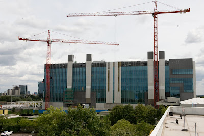
BSKYB HEADQUARTERS, OSTERLEY, LONDON BY ARUP ASSOCIATES FOR STANHOPE

Oh, this one's shaping up really nicely, isn't it?
Surprisingly, the cranes in this picture are actually not demolishing this giant slab of greeny-blue glazing, they're building it, putting the finishing touches to a building that will contribute as much character and joy to the city as it will carbon to the atmosphere - almost none.
Arup Associates say that this will be one of the most sustainable broadcasting facilities in Europe (I wonder how much competition there is for that title?), and that 'the architecture of the building dramatically expresses the integrated and world-leading sustainable technology'. Those big white things that look like lift cores are actually natural ventilation chimneys. Why couldn't they make the architecture of the building 'dramatically express' something that actually means something to someone, rather than cladding some big chimneys in white steel to make us aware of how much Mr Murdoch loves polar bears?
Lovely work boys, an absolute picture. Hey, Stanhope! Just because it's sustainable, doesn't mean we can't see it's a piece of shit.

Wednesday 23 September 2009

THRELKELD VILLAGE HALL, THRELKELD, CUMBRIA BY GREEN DESIGN GROUP

WHAT IN GOD'S NAME IS GOING ON HERE? WHEN THE GOVERNMENT GIVES OUT ECO GRANTS TO STOP BUILDINGS DESTROYING THE WORLD, THEY SHOULD REALLY FUCKING READ THE APPLICATIONS TO ESTABLISH WHETHER THE BUILDINGS THEY ARE FUNDING WILL INSTEAD DESTROY OUR RETINAS WITH THEIR EXTREME FUGLINESS.
LOOK AT THE BIG PURPLE SLOPEY COLUMN. LOOK AT THE 'FULLY DDA COMPLIANT' ENTRANCE SEQUENCE. LOOK AT THE TRULY BIZARRE INWARD SLOPING WINDOWS ON THE RIGHT.
THIS HAS ACTUALLY GOT PLANNING PERMISSION, BUT THEY'RE STILL FUNDRAISING, SO WE CAN STILL MAN THE BARRICADES IN THRELKELD. I DON'T EVEN KNOW WHERE THRELKELD IS, BUT I'M PRETTY SURE IT'LL BE ON GOOGLE MAPS. WHO'S WITH ME?
AND WHAT THE FUCK ARE THOSE CHILDREN DOING TO THAT DOG IN THE FOREGROUND OF THIS PICTURE?

Tuesday 22 September 2009

DERBY COLLEGE CAMPUS, DERBY, BY MABER ARCHITECTS

This building is part of a broader masterplan for Derby College, made up of buildings of bad-to-mediocre quality by Midlands-based Maber Architects. But this one is utterly shit.
The strategy was to make a really big box, based on the form of a cereal packet, and then 'break down its scale' (this is me putting words in their mouths, by the way) by using a shitty modularised cladding system in grey and black. They had one good idea - the canopy - but that emphasises just how much this building belongs on a business park.

Tuesday 15 September 2009

ROCHDALE TOWN CENTRE MASTERPLAN, BY ROCHDALE METROPOLITAN BOROUGH COUNCIL

The image above, referred to as a 'masterplan' by Rochdale council, is the city fathers' compelling vision of how they will turn the space around Rochdale town hall into one of Europe's biggest public spaces. I tell you this in case you were labouring under the impression that said image was created by a child in a remedial class with only three felt tips to choose from: puce, flesh and powder blue.
If you will permit me to take a quote completely out of context, council leader Alan Taylor knows it shit but added: "We make no apologies for this." Well, thanks Alan.
You might think that this schematic is a little light on use and programme (beyond the visionary 'water features' that multiply offensively across the Stalin-style steppe that constitutes the new public space), but you'd be wrong. Look at the visualisation below:
They've thought hard about an innovative mix of 'cafe' on the ground floor with outdoor seating next to a dual carriageway, with 'mixed-use' space above it. Helpfully, they have placed two people in the 'mixed-use' space, presumably doing a mix of things. So you can really feel that mix happening.
Finally a key plank of revitalising the city centre will be to plant some trees, and then spray paint them purple:

Can anyone from Rochdale shed any light on this amateurish nonsense?

With many thanks to a contributor for this one...

Tuesday 8 September 2009

BURNS MONUMENT CENTRE, KAY PARK IN KILMARNOCK BY EAST AYRSHIRE ASSET IMPROVEMENT SERVICE


Wow. This is one of those projects that the local authority architect thought: "I can do this. This is my big chance. Those fancy-dan architects from Glasgow/London will finally recognise the genius of us Ayrshire natives." So the local authority didn't have a competition, didn't take any advice and went with its own, terribly untalented architecture office. The result is this embarassing lump of sandstone, stranglingly enclosing what remains of a listed monument.
The Robert Burns monument used to be a charming and slightly mad folly of a tower, which burned down in 2006. It was in sandstone, with a mad mixture of Scots baronial, neo-gothic and baroque providing a suitably romantic/absurd setting for the Scottish bard's memory. For its replacement, the designers went with slopey-roofed shit-bikeshed style, with a liberal dash of Kalzip and a touch of Hackney Marshes changing rooms (the old ones).

Really loving the powder blue window frames, guys.
Many thanks to 'anon' for this one.

Monday 7 September 2009

UNITED REFORMED CHURCH, EAST WITTERING BY HOME PLAN-IT AND SCOTFRAME


Now, I realise the United Reformed Church is not that interested in the architecture of its churches, and that it hasn't really contributed much to the history of sacred buildings. But this is ridiculous.
I suppose you could say that this is the plain style - a shit developer house, scaled up with a cross stuck on the gable. It's not meant to look any different from the places you live. But surely, surely there could have been a little more love taken here without compromising the Calvinist roots of the church? Some pleasure to the entrance sequence instead of an acre of tarmac, for instance?
From the outside, it looks as though the internal volume could be ok, an airy space with exposed glu-lam rafters. But no. Instead, they did this:

I'm sorry, but I'd rather burn than spend my Sunday mornings in this place...

Friday 4 September 2009

SKY PLAZA STUDENT HOUSING IN LEEDS BY CAREY JONES ARCHITECTS


This is a recession, which means that land values are lower than they were, which means that student housing developers can afford to get in there and build some shit buildings for young people to live in. Then, the poor students get overcharged for the privilege of having sex and throwing up and setting off smoke alarms in an eyesore.
Unite is the developer of this building, and they're responsible for loads of shite in cities all over the country (this one in Manchester looks like an old people's home, this one in Edinburgh is a shit bit of Scottish contextualism and this one in London like 1980s housing for people likely to harm themselves). Unite is by no means to only developer doing shit buildings for students, and this will not be the last student residence to appear here.
Sky Plaza, above, is in Leeds, and is the tallest student housing IN THE WOOOOOORLD as if that is either here or there. 37 storeys. 103 metres. Look at the pic above: the buildings next door are pretty big. This one's a monster. The proportions are fat and deadening as the lumpen mass of it obnoxiously blots out the sky.
The composition of the facades, or lack of, is, in my experience, what really distinguishes bad architects from good. Bad architects don't so much compose facades, as choose a pattern and use a tiling command to extend it across the whole facade. When they do try to design one, this happens.
Here, Carey Jones opted to make loads of tiny windows march across the facade with a monotonous lack of verve.


When the architects at Carey Jones were students, do you think they dreamed of doing buildings like this?

Tuesday 25 August 2009

NATIONAL CURLING ACADEMY IN KINROSS, BY ARCHIAL ARCHITECTS

You might have to click on this one to see it properly, but it is a quite remarkable drawing of possibly the ugliest sports hall you'll ever see. What's really, really bad about Archial is that they can't just accept they're rubbish. They feel a pressing need to 'do design', making funky (as in 'offensively malodorous') windows as in the right-hand side of the north elevation, and bizarre supergraphics.
The supergraphic totally confused me to begin with, until I realised it's a cack-handed version of an Otl Aicher pictogram. It's someone curling, of course. Although it looks at best like an Edwardian rugby player, and at worst someone readying themselves for a painful shafting.
OK, a little competition with this post. Can you make head or tail of Archial director Charles Smith?
From the press release: Charles Smith, director at Archial Architects, said, “The general design features of the building reflect the intentions for a world class facility. The elevational treatment of the building is suitably distinctive and will enhance the site’s sense of identity and linkages to the adjacent rural character, using natural, sustainable materials such as timber cladding within the scheme, which creates a horizontal emphasis to the building."
Hm, OK. I'm not sure I know exactly what you mean.
“The use of different materials externally relates directly to the internal composition, therefore linking the internal space arrangements with the external appearance which, in turn, relates to the site and its origins."
Sorry, Charles, you've lost me there.
“Whilst the development is to become an integral part of one of Kinross-shire’s main settlements, the palette chosen specifically reflects the rural setting, enhancing the natural materials and complementing the landscaped setting.”
Yep. Absolutely no idea what you're getting at. Good luck with the planning application, though. The committee should be like a Beckett play if he carries on like that. Might be worth sitting in...

Monday 24 August 2009

UNDERGROUND CONTROL CENTRE, WEST LONDON BY MORGAN PROFESSIONAL SERVICES

This is the kind of shite that London Underground commissions these days. While in Switzerland you get signal boxes by Herzog & de Meuron etc, in our nation's capital you get a giant bunker that isn't so much ugly as completely undesigned. It's just acres of grey surface, undifferentiated apart from what appears to be four downpipes marching across the facade. Interesting how shit architects are always very precise about downpipes in their visualisations.
Morgan Professional Services is the kind of multi-disciplinary that believes in 'creative collaboration', the kind of platitude that today's construction industry sprouts like acne on a teenager's face. It's impossible to not believe in creative collaboration, of course, but when all you have to send press releases out about is a building like this one, you have to ask yourself what all that creativity and collaboration has brought you to.
Here's the back:
A close up of that green wall (designed to 'minimise visual impact' and 'soften' this humungous building), two years on:
No, not really. That's DSDHA's little bit of Paradise. But it's a fair approximation.
Inside, it's the normal Dr Strangelove/Gattaca kind of thing:Many thanks to an esteemed correspondent for this one...

Monday 17 August 2009

DORCHESTER MEDICAL CENTRE, BREWERY SQUARE, DORSET BY CZWG

CZWG are bad architects, peddling their weird brand of postmodernism up and down the country. But this one's gone too far. It's cartoon art deco, with a stupid, cartoon art deco typeface above the door. It does nothing to dignify its sullen but very English context, just shouts as loud as it can.
Possibly CZWG is trying to provide the next logical progression in the Prince Charles pastiche
around Dorchester. That isn't real Georgian, and this isn't real, well, anything. It's probably trying to be bingo hall, Wurlitzer, popular architecture, but in fact it's three sets of curvy goalposts. It has no richness, no detail.
There are 24 CZWG buildings in this masterplan. So the town's basically fucked.

Wednesday 22 July 2009

BLAR MHOR HOUSING IN CAOL, FORT WILLIAM BY ARCHIAL FOR LORNE DEVELOPMENTS

Regular readers will be aware of what I consider to be just about the most prolific bad architect in the UK. Step forward Archial, the conglomerate that will be shitting out something awful in your neighbourhood very soon. I've had reason to think that they read this blog before, but now I know they do. Imagine the scene.
"Lads, we have a 300-home masterplan to do in Scotland, but we're shite at masterplanning. What shall we do?"
"I can't remember where I saw it, but whoever it is who made those great drawings of the Leyland Bus site has got real talent - we should hire him/her."
And they obviously did. This masterplan is much, much worse, though, with an even bigger array of Brookside Close moments, and a truly flagrant disregard for any existing geographical or architectural features of the place. Councils! You can have better than this! Just commission a good architect (there are other websites with some of those on them) rather than an utterly shit one who will transplant an urban and architectural language from out of their arse into your town.
One helpful rule of thumb, from Nairn to you. When someone presents a masterplan with a perimeter of a line of trees, it means they're trying to hide something. Do not trust these people.


And the housing itself? Mush. Just mush.

Tuesday 21 July 2009

SPIRE HOSPITAL, THE GLEN, BRISTOL BY STRADFORM

Spire Hospital is a national centre of excellence for 'cardiac, brain and spinal surgery', apparently. It's a private hospital, so it has loads of cash. But not only can they not afford an architect for their extension, but they don't pay their contractor enough to use a proper CAD package. Sketchup hell ensues.
As for the building itself, is it just me, or can I detect influences of Elizabethan theatre architecture in the above picture? In any case, it will win the award for 'greatest number of differently pitched roofs in the smallest possible building'.
Whereas this part of the extension adopts a more modern idiom, the image excelling in expressing just how bad the chequerboard cladding will look on completion. The roof appears to be made of corrugated iron.
There was one architect involved in this, as planning consultant: Turley Associates, you are hereby named and shamed for your part in this atrocity.

Monday 20 July 2009

WOODLAND COMMUNITY PRIMARY SCHOOL, ROCHDALE BY NPS ARCHITECTS

FAT SHED WITH TINY WINDOWS. THAT'S WHAT WE SHOULD EDUCATE THE VERY YOUNG IN THESE DAYS. IF IT FAILS AS A SCHOOL, YOU CAN ALWAYS TURN IT INTO A FUCKING DISTRIBUTION SHED. THIS IS WHAT HAPPENS WHEN, LIKE NPS, YOU HAVE A BOARD OF DIRECTORS WHO LOOK LIKE NEWS OF THE WORLD PAEDOPHILES.

Wednesday 8 July 2009

CARPENTERS PLACE, KNOWLE, BRISTOL BY CIRCLE CONSTRUCTION FOR EMINENCE DEVELOPMENTS

This building is the reason we started this blog. Absolute drivel, posing as contextual housing. The inexplicable symmetry, accentuated by black plastic extracts and downpipes; timber cladding that is varnished so hideously that it no longer looks like wood; 'balconies' that are not balconies (the three bonsai shrubs behind the top balcony in the middle are a heartbreaking expression of what the residents really wanted); regulation beige brick; the mud borders showing how money ran out before the landscaping was finished.
The building replaces a pub called the Venture Inn, which faced this square in West Knowle. Housing developers and local authorities care not a toss for social spaces like pubs and corner shops. They'd rather have flats full of junior management consultants than communities.
The inn's replacement is the architectural equivalent of porridge. Bland, formless, cloying, does nothing more than fill a hole.

Wednesday 1 July 2009

PIER HEAD FERRY TERMINAL, LIVERPOOL BY HAMILTON ARCHITECTS

Hmm, I wonder what they've been putting in the tea at Hamilton Architects? The practice has what you might euphemistically describe as a 'mixed' portfolio, ranging from fugly Georgiana to a plasticky hospital. But here they were clearly given a bit of a budget, and decided to give free reign to their frustrated avant-gardism.
It riffs on the new (and nearby) Museum of Liverpool by 3XN, with a stone-clad slightly angular form. they've then gone ahead and made some hideously ill-considered glazed cut outs that collide horribly with the already deeply questionable geometry.
This building is what happens when a bad architect reads a few too many architecture magazines, and think that doing shapes is a good idea. The result is this anti-context, anti-scale, uncivilised building, exuding a staggering lack of decorum on the benighted World Heritage Site that is Liverpool's waterfront.
When shit practices do shapes, it also reveals the absolute stupidity and rampant subjectivity of architecture today. This was the winner of an international competition - the jury probably thought they were getting a B-team Libeskind or something.
Liverpool people will be relieved to hear that the programme of this building is an absolutely essential addition to the city's cultural landscape - a second Beatles Museum. The museum promises a "magical journey through the music of the Beatles, complete with motion, sound and water". Sounds like a museological fucking revolution.
According to the architect, the building has become popular with 'photographers' because of its 'quirky' 'angles'. Unfortunately, as you can see from the photos above, it has become popular with really shit photographers, who barely know how to hold their cameras up straight.

Tuesday 30 June 2009

WATERLANE SPORTS CENTRE, LOWESTOFT BY DV8 DESIGNS

It's very difficult for the uneducated observer to understand what the jazzily named DV8 ("We pride ourselves on providing a friendly, down to earth, supportive and competant [sic] service") is doing, spatially, with this building from their 2D elevation rendering.
Helpfully, they provided the section below to explain the scheme better, so we can really understand the 3-dimensional complexity of the proposal, feel the play of light and sound, and have evoked for us the intricate mix of programmes that make this into so much more than a D&B leisure centre.HAHAHAHAHAHAHAHAHAHAHAHA!
Look at how the dance studio is evoked in this section as a place ideally suited to the joyous expression of the human body. And how the staff are given the best space in the building, dignifying their important role as guardians of the community's health and fitness.
1st year student... my mum can draw better... worst section I've ever seen... etc...

Wednesday 10 June 2009

GREATER MANCHESTER POLICE AUTHORITY HQ, CENTRAL PARK, EAST MANCHESTER BY AEDAS

Oh Aedas, you make really bad architecture quite a lot of the time. Here is a quite monumentally ordinary building for the police on a business park in Manchester. What I like about it most is how it marks the corner entrance with a full-height void, a big glass atrium and one spindly column sticking up. And what does this sculptural corner, wherein all the architecture of this building is contained, face? A roundabout.
They could have at least make it convenient for the cops, who, arriving by car and parking presumably at the back of this building, will have to walk all the way around it to get inside. People driving by won't care anyway. They'll be too busy crashing after belly laughing at the pathetic piece of public art that occupies the centre of this roundabout. I wonder if Aedas designed that, too?

Thursday 4 June 2009

QUICK LINK LITE DEPLOYABLE BARRIER SYSTEM BY CORUS, HYDE PARK, LONDON

A VBIED is a vehicle-borne improvised explosive device. A car bomb. When you absolutely, positively need to keep fundamentalist terrorists or ecosocialist nutters from carbombing your shrubbery, you can deploy the Quick Link Lite barrier system like this...

at the impressive rate of 30 metres of barrier per hour with 'minimum disruption'.
This is the architectural expression of how the government has allowed the police, through terror legislation (specifically in this case Lord West's terrorism strategy CONTEST2) to militarise our public realm unabashedly and completely. The top picture looks like a checkpoint along the Berlin wall, and I think it's really interesting how the photographer has tried to give it the maximum intimadation factor by taking the picture from down low.
Quick Link Lite was first used at the G20 summit in London in April, and is coming soon to a perfectly legal and peaceful demonstration near you...

Wednesday 3 June 2009

HOUSE POD BY ECO-MODS, ANYWHEREVILLE

The picture above is of the bleeding edge of the British construction industry, the technology that will solve the crisis in British housebuilding in terms of environmental sustainability, build quality and aesthetics. Behold, the House Pod.
There was a time when the future looked like the future, and so on and so forth, but now all the future aspires to be is profitable. And that means shite like this. We've seen this before on this blog.
They're weird, though. The roofline on this terrace alternates high gables and dormer windows to try to give the impression that these are triple fronted detached houses, when noone could make that mistake thanks to the oversized porch canopies (with flashings and wheelie bins in syncopated rhythms along the street).
These houses will be substantially built off site in a factory. We've heard this before (almost every six months. The biggest noise I remember is Yorkon and its Murray Grove flats in London. Yorkon seems to have given up on resi now, by the looks of its website), and it hasn't transformed the supply chain yet.
Listen, though, there will be 'no compromise on quality' in this factory-made future, according to the press release, because 'The House Pod is building regulation compliant'. Well, that's a relief! The future of mass-manufactured sustainable housing will keep the rain out. The text also describes how the pod 'can currently meet levels 3, 4 and 5 of the Code for Sustainable Homes.' So you can choose how slowly you want your modular development to kill the planet.
Naked, the House Pod looks like this, which is, to my mind, an improvement, although there are DDA issues with the front door.

Tuesday 2 June 2009

FOREST WAY SEN SCHOOL, COALVILLE, LEICESTERSHIRE BY HUNTERS

You know how architects always tell their clients that the proposed timber cladding will 'weather down' into a shimmering grey colour? Well, they're lying. In this case it's Hunters' sweet chestnut cladding on a special needs school in Leicestershire, looking pretty ropey a few months after opening. Click on the picture for the close-up horror.
This school is sustainable. So sustainable, in fact, that trees grow inside the building!
This might be my first example on this blog of something that's so bad, it's good.

Friday 1 May 2009

ST MARY'S ROAD HOUSING, PECKHAM BY ALAN CAMP ARCHITECTS FOR L&Q

WAIT A MINUTE, NO, YOU CAN'T DO THAT. YOU HAVEN'T FINISHED FUCKING DESIGNING IT YET. YOU CAN'T JUST SEND OUT AN IMAGE OF A LOAD OF GREY WALLS IN SKETCHUP. OH, IT'S ALREADY GOT PLANNING PERMISSION? OH. OKAY THEN. FUCK IT. JUST PUT SOME TREES ON IT AND SEND IT OUT.

Wednesday 29 April 2009

BMW DEALERSHIP, BEDDINGTON, LONDON BY TALBOT CONSTRUCTION

Car dealerships are a breed of their own in British architecture. I don't know whether there are dedicated building regulations for them, or quite how this genus of the species 'bad architecture' has developed in the way it has. They always look uniquely clipped together and temporary. It is as if car dealership design has developed on Easter Island: you can see where it came from, but at some point it stopped having any relationship with the rest of the construction industry.
The constructional logic is derived from the sign - a structure with clipped-on symbols. Like all buildings like this, the cladding system is a law unto itself with strangely small panels contrasting with the over large and annoyingly reflective glazing. Look at the picture above: in its vertical expression, there is no hierarchy between glazing member, structural column, downpipe and advertising hoarding.
This is unreal architecture, the same wherever it appears. It embodies nothing about BMW, nothing about the excitement of the expensive machines inside. It's the kind of building that shoddy planning authorities allow to pollute the roadside when they can't think of anything else to do with a site.
By the way, I love that this super-generic building intended to promote carbon-guzzling machines is in the same town as the godmother of eco developments, BedZed. Way to have a joined-up strategy, London Borough of Croydon.

Monday 20 April 2009

SWALLOW FIELDS HOUSING IN TIPTON, WEST MIDLANDS BY CONCEPT DEVELOPMENT SOLUTIONS

THIS BUILDING IS THE DEVIL, IT IS THE ENEMY, IT IS SO UNREMITTINGLY FUCKING GRIM THAT IT'S HARD TO EVEN LOOK AT THE PICTURE WITHOUT IT DAMAGING YOU.
IT'S A COMBINATION OF BOTCHED CURTAIN WALLING, WINDOWS THAT DON'T FIT THE HOLES THEY'RE IN, ALL TOPPED OFF WITH A HAT THAT LOOKS LIKE AN ARMY SENTRY POST IN WEST BELFAST. JUST NEEDS A BIG FUCKING GUN TURRET ON TOP AND IT WOULD FIT RIGHT IN.
SMALL OBSERVATION - I CAN HONESTLY SAY THAT I'VE NEVER SEEN EFFLORESCENCE ON THE MORTAR BETWEEN TERRACOTTA BOLLOCKING TILES.
THIS BUILDING WAS SHORTLISTED FOR A FUCKING AWARD. IT COULD HAVE WALKED AWAY WITH 'BEST RSL-LED LARGE DEVELOPMENT' AT THE AFFORDABLE HOME OWNERSHIP AWARDS. ADMITTEDLY THAT IS NOT A PARTICULARLY COMPETITIVE CONTEXT, BUT FOR FUCK'S SAKE. THE REF MUST HAVE BEEN BLIND.
APPARENTLY 'THE CONCEPT DEVELOPMENT SOLUTIONS TEAM IS RECOGNISED THROUGHOUT THE MIDLANDS FOR ITS EXPERTISE AND INNOVATION.' EVERYONE IN THE FUCKING MIDLANDS SHOULD GET OUT MORE.

Tuesday 14 April 2009

LEYLAND BUS REDEVELOPMENT, LEYLAND BY STEVEN ABBOTT ASSOCIATES AND TAYLOR YOUNG

Urban design in Britain must be about the worst in the civilised world. This masterplan shows why, with a variety of autumnal shades used to demonstrate how little clue we have about making real streets, real neighbourhoods or real connections with the fabric of the city. Look at the perimeter, to start with. The site is almost entirely removed from any engagement with its context by lines of trees. Look at the shared surfaces at the road junctions - a shitty brown colour picks out the spaces that no kids will play on (still too dangerous) but that will cause maximum annoyance to motorists. Look at the sub-Brookside close in the bottom left. This is town planning done at the developer's behest, with no regard to what makes a town work. There's no real public space, just the semi-private kind masquerading. Look at the small blue spots - these denote what the architect refers to as 'garden squares'. They look more like car parks to me. Urban planning in this country has assimilated the propaganda about placemaking from bodies like CABE, and carried on doing the same old crap the housebuilders always wanted from its pathetically pliant consultants. Here are some of the houses:
Oceans of indeterminate watercoloured green space and some sketchy housing helpfully obscured by the trees. A party wall (to the left) left white because they don't know what to fucking do with it. That's a problem that English architecture has had for 300 years, and the designers of this scheme don't even try to dignify the problem.
So, why are these houses so awful? Roger Lomas of Taylor Young can enlighten us: "The objective of the proposals was to create homes not houses, places not spaces and a community rather than an estate." I wonder how they're measuring such scientific metrics?
Urban designers in this country talk crap all the time, government-approved crap that reassures planners while pulling the wool over their eyes time and again.
The elevations? You'll be sorry you asked...