Showing posts with label london. Show all posts

Thursday, 24 September 2009

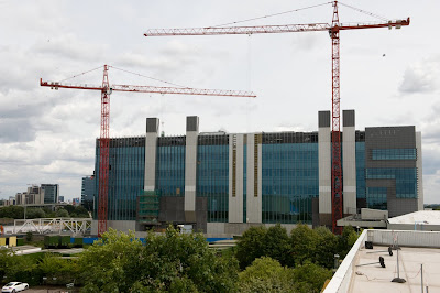
BSKYB HEADQUARTERS, OSTERLEY, LONDON BY ARUP ASSOCIATES FOR STANHOPE

Oh, this one's shaping up really nicely, isn't it?
Surprisingly, the cranes in this picture are actually not demolishing this giant slab of greeny-blue glazing, they're building it, putting the finishing touches to a building that will contribute as much character and joy to the city as it will carbon to the atmosphere - almost none.
Arup Associates say that this will be one of the most sustainable broadcasting facilities in Europe (I wonder how much competition there is for that title?), and that 'the architecture of the building dramatically expresses the integrated and world-leading sustainable technology'. Those big white things that look like lift cores are actually natural ventilation chimneys. Why couldn't they make the architecture of the building 'dramatically express' something that actually means something to someone, rather than cladding some big chimneys in white steel to make us aware of how much Mr Murdoch loves polar bears?
Lovely work boys, an absolute picture. Hey, Stanhope! Just because it's sustainable, doesn't mean we can't see it's a piece of shit.

Monday, 24 August 2009

UNDERGROUND CONTROL CENTRE, WEST LONDON BY MORGAN PROFESSIONAL SERVICES

This is the kind of shite that London Underground commissions these days. While in Switzerland you get signal boxes by Herzog & de Meuron etc, in our nation's capital you get a giant bunker that isn't so much ugly as completely undesigned. It's just acres of grey surface, undifferentiated apart from what appears to be four downpipes marching across the facade. Interesting how shit architects are always very precise about downpipes in their visualisations.
Morgan Professional Services is the kind of multi-disciplinary that believes in 'creative collaboration', the kind of platitude that today's construction industry sprouts like acne on a teenager's face. It's impossible to not believe in creative collaboration, of course, but when all you have to send press releases out about is a building like this one, you have to ask yourself what all that creativity and collaboration has brought you to.
Here's the back:
A close up of that green wall (designed to 'minimise visual impact' and 'soften' this humungous building), two years on:
No, not really. That's DSDHA's little bit of Paradise. But it's a fair approximation.
Inside, it's the normal Dr Strangelove/Gattaca kind of thing:Many thanks to an esteemed correspondent for this one...

Thursday, 4 June 2009

QUICK LINK LITE DEPLOYABLE BARRIER SYSTEM BY CORUS, HYDE PARK, LONDON

A VBIED is a vehicle-borne improvised explosive device. A car bomb. When you absolutely, positively need to keep fundamentalist terrorists or ecosocialist nutters from carbombing your shrubbery, you can deploy the Quick Link Lite barrier system like this...

at the impressive rate of 30 metres of barrier per hour with 'minimum disruption'.
This is the architectural expression of how the government has allowed the police, through terror legislation (specifically in this case Lord West's terrorism strategy CONTEST2) to militarise our public realm unabashedly and completely. The top picture looks like a checkpoint along the Berlin wall, and I think it's really interesting how the photographer has tried to give it the maximum intimadation factor by taking the picture from down low.
Quick Link Lite was first used at the G20 summit in London in April, and is coming soon to a perfectly legal and peaceful demonstration near you...

Friday, 1 May 2009

ST MARY'S ROAD HOUSING, PECKHAM BY ALAN CAMP ARCHITECTS FOR L&Q

WAIT A MINUTE, NO, YOU CAN'T DO THAT. YOU HAVEN'T FINISHED FUCKING DESIGNING IT YET. YOU CAN'T JUST SEND OUT AN IMAGE OF A LOAD OF GREY WALLS IN SKETCHUP. OH, IT'S ALREADY GOT PLANNING PERMISSION? OH. OKAY THEN. FUCK IT. JUST PUT SOME TREES ON IT AND SEND IT OUT.

Wednesday, 29 April 2009

BMW DEALERSHIP, BEDDINGTON, LONDON BY TALBOT CONSTRUCTION

Car dealerships are a breed of their own in British architecture. I don't know whether there are dedicated building regulations for them, or quite how this genus of the species 'bad architecture' has developed in the way it has. They always look uniquely clipped together and temporary. It is as if car dealership design has developed on Easter Island: you can see where it came from, but at some point it stopped having any relationship with the rest of the construction industry.
The constructional logic is derived from the sign - a structure with clipped-on symbols. Like all buildings like this, the cladding system is a law unto itself with strangely small panels contrasting with the over large and annoyingly reflective glazing. Look at the picture above: in its vertical expression, there is no hierarchy between glazing member, structural column, downpipe and advertising hoarding.
This is unreal architecture, the same wherever it appears. It embodies nothing about BMW, nothing about the excitement of the expensive machines inside. It's the kind of building that shoddy planning authorities allow to pollute the roadside when they can't think of anything else to do with a site.
By the way, I love that this super-generic building intended to promote carbon-guzzling machines is in the same town as the godmother of eco developments, BedZed. Way to have a joined-up strategy, London Borough of Croydon.

Monday, 9 March 2009

SIDCUP LEISURE CENTRE, BEXLEY BY BURKE RICKHARDS


I blame Norman Foster for this. Admittedly, he used to be a pretty good architect, but the problem with the British high-tech masters of the universe is that they delighted in creating problems they then had to solve with great rhetorical flourish and fake functionalism. Which brings us to to this little number.
What kind of architect decides that a really transparent south-facing facade is a good idea (I assume it's south from the angle of the shadow of the tree in the second picture), and then, on discovering the greenhouse-like environment he or she has created, decides to ring up Levolux to sort it out with a few louvres?
Well, this kind, clearly. Then Burke Rickhards goes crazy with the whole high-tech classicism thing, making a symmetrical facade with a fake colonnade (said Levolux construction). This is just ordinary, perverse, weird architecture with no character, craft or guile. Somewhere in the DNA of this building is Foster's CarrĂ© d’Art in Nimes, but so mutated as to be unrecognisible.
Also, check out the number of bollards in front of the glazed central portion of the facade, presumably to stop a Glasgow Airport-style terrorist attack. On Sidcup Leisure Centre. This is another problem, created by the architect, solved by a cack-handed highway engineer and as a result littering the public realm with more unnecessary flotsam.

Sunday, 8 March 2009

PERSPECTIVE HOUSING, LAMBETH, LONDON BY ASSAEL

Debt-loaded housing developer Crest Nicholson is not known for its patronage of great contemporary architecture. This is well documented online. But this brute is as bad as it gets. The architect, Assael, is frequently included in the Sunday Times' list of best employers in the country, but I'd need more than a softball team and a decent pension to tolerate working on a project like this. Maybe they give out free crack to their employees at lunchtime.
The project is a conversion of an office building formerly occupied by MI6. So far, so sustainable. But what Assael was thinking when it dressed it up for the 21st century, god only knows. Firstly, they created a ham-fistedly 'iconic' entrance, presumably to give the modernist building some presence on the street. The white-painted tree-like columns are horribly twiggy and supports a roof (presumably modelled on the Nike tick) that is horribly, clunkily thick.
But it's the tower that's really bad. You can see what they were thinking. Clad the bottom five storeys in terracotta so it 'relates to the cityscape', and then do whatever the fuck you like above that. The top of the tower is just hilarious. It reminds me of Taipei 101, but without the elegance.
This conversion is award winning, believe it or not. It is a truism that if you can be arsed to enter, you can win an award for anything in this self-congratulatory architectural culture.

Saturday, 7 March 2009

RAM BREWERY HOUSING, WANDSWORTH, LONDON BY EPR

It is one of the great scandals of the early 21st century in London that we have allowed so much of this kind of crap to go up all over the place. It's quite difficult for the untrained observer to understand why this happens. After all, anyone can see that this proposal is an utter dog.
But somehow, if you mix in enough different materials, put some panels of timber in random places on the facade, give it an active ground floor (that will in fact remain unoccupied for ages), and then stick a funny hat on the high bits (as if this made the towers somehow less offensively engorged) you can rely on planners to become snowblind, and wave it on through.
This works best if you are one of the following architects: HTA, Stock Woolstonecroft, EPR, PRP or Levitt Bernstein.
I am hoping to god that this project, for 829 flats, has become comprehensively credit crunched, to save the inhabitants of Buckhold Road from EPR's deadly 'urban square' and its appalling "landmark" towers.
Note to EPR. A building doesn't count as a landmark just because it is loads fucking bigger than anything around it.