Despite the funding falling through for almost all further education colleges in the country, Oaklands College in St Albans is so desperate to build this beauty that it is going to put up the money itself.
The college has already spent £12 million on professional fees and taking the building through a public enquiry (successfully) after the proposal was called in by the secretary of state. Now it wants to spend another £100 million inflicting this strange catherine wheel of a building on the landscape in reality.
I really like how carefully the architect has thought about the parking, so that the building relates to the landscape around it about as well as an American supermall might. This building was called in because it was in the greenbelt. What on earth made the government decide this was ok?
I think someone at Bond Bryan has been spending a bit too much time with his or her mandala.
Wednesday, 30 September 2009
Thursday, 24 September 2009
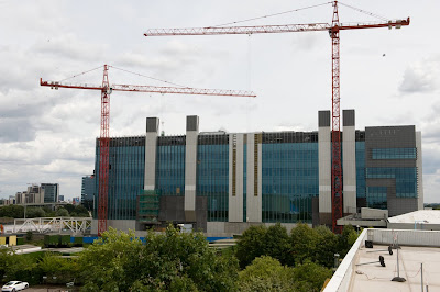
BSKYB HEADQUARTERS, OSTERLEY, LONDON BY ARUP ASSOCIATES FOR STANHOPE
Oh, this one's shaping up really nicely, isn't it?
Surprisingly, the cranes in this picture are actually not demolishing this giant slab of greeny-blue glazing, they're building it, putting the finishing touches to a building that will contribute as much character and joy to the city as it will carbon to the atmosphere - almost none.
Arup Associates say that this will be one of the most sustainable broadcasting facilities in Europe (I wonder how much competition there is for that title?), and that 'the architecture of the building dramatically expresses the integrated and world-leading sustainable technology'. Those big white things that look like lift cores are actually natural ventilation chimneys. Why couldn't they make the architecture of the building 'dramatically express' something that actually means something to someone, rather than cladding some big chimneys in white steel to make us aware of how much Mr Murdoch loves polar bears?
Lovely work boys, an absolute picture. Hey, Stanhope! Just because it's sustainable, doesn't mean we can't see it's a piece of shit.
Labels:
arup associates,
london,
office,
stanhope,
tv studio
Wednesday, 23 September 2009
THRELKELD VILLAGE HALL, THRELKELD, CUMBRIA BY GREEN DESIGN GROUP
WHAT IN GOD'S NAME IS GOING ON HERE? WHEN THE GOVERNMENT GIVES OUT ECO GRANTS TO STOP BUILDINGS DESTROYING THE WORLD, THEY SHOULD REALLY FUCKING READ THE APPLICATIONS TO ESTABLISH WHETHER THE BUILDINGS THEY ARE FUNDING WILL INSTEAD DESTROY OUR RETINAS WITH THEIR EXTREME FUGLINESS.
LOOK AT THE BIG PURPLE SLOPEY COLUMN. LOOK AT THE 'FULLY DDA COMPLIANT' ENTRANCE SEQUENCE. LOOK AT THE TRULY BIZARRE INWARD SLOPING WINDOWS ON THE RIGHT.
THIS HAS ACTUALLY GOT PLANNING PERMISSION, BUT THEY'RE STILL FUNDRAISING, SO WE CAN STILL MAN THE BARRICADES IN THRELKELD. I DON'T EVEN KNOW WHERE THRELKELD IS, BUT I'M PRETTY SURE IT'LL BE ON GOOGLE MAPS. WHO'S WITH ME?
AND WHAT THE FUCK ARE THOSE CHILDREN DOING TO THAT DOG IN THE FOREGROUND OF THIS PICTURE?
Labels:
cumbria,
green design group,
threlkeld,
village hall
Tuesday, 22 September 2009
DERBY COLLEGE CAMPUS, DERBY, BY MABER ARCHITECTS
This building is part of a broader masterplan for Derby College, made up of buildings of bad-to-mediocre quality by Midlands-based Maber Architects. But this one is utterly shit.
The strategy was to make a really big box, based on the form of a cereal packet, and then 'break down its scale' (this is me putting words in their mouths, by the way) by using a shitty modularised cladding system in grey and black. They had one good idea - the canopy - but that emphasises just how much this building belongs on a business park.
Tuesday, 15 September 2009
ROCHDALE TOWN CENTRE MASTERPLAN, BY ROCHDALE METROPOLITAN BOROUGH COUNCIL
The image above, referred to as a 'masterplan' by Rochdale council, is the city fathers' compelling vision of how they will turn the space around Rochdale town hall into one of Europe's biggest public spaces. I tell you this in case you were labouring under the impression that said image was created by a child in a remedial class with only three felt tips to choose from: puce, flesh and powder blue.
If you will permit me to take a quote completely out of context, council leader Alan Taylor knows it shit but added: "We make no apologies for this." Well, thanks Alan.
You might think that this schematic is a little light on use and programme (beyond the visionary 'water features' that multiply offensively across the Stalin-style steppe that constitutes the new public space), but you'd be wrong. Look at the visualisation below:
They've thought hard about an innovative mix of 'cafe' on the ground floor with outdoor seating next to a dual carriageway, with 'mixed-use' space above it. Helpfully, they have placed two people in the 'mixed-use' space, presumably doing a mix of things. So you can really feel that mix happening.
Finally a key plank of revitalising the city centre will be to plant some trees, and then spray paint them purple:
Can anyone from Rochdale shed any light on this amateurish nonsense?
With many thanks to a contributor for this one...
Labels:
localauthorityarchitect,
MASTERPLAN,
rochdale
Tuesday, 8 September 2009
BURNS MONUMENT CENTRE, KAY PARK IN KILMARNOCK BY EAST AYRSHIRE ASSET IMPROVEMENT SERVICE
Wow. This is one of those projects that the local authority architect thought: "I can do this. This is my big chance. Those fancy-dan architects from Glasgow/London will finally recognise the genius of us Ayrshire natives." So the local authority didn't have a competition, didn't take any advice and went with its own, terribly untalented architecture office. The result is this embarassing lump of sandstone, stranglingly enclosing what remains of a listed monument.
The Robert Burns monument used to be a charming and slightly mad folly of a tower, which burned down in 2006. It was in sandstone, with a mad mixture of Scots baronial, neo-gothic and baroque providing a suitably romantic/absurd setting for the Scottish bard's memory. For its replacement, the designers went with slopey-roofed shit-bikeshed style, with a liberal dash of Kalzip and a touch of Hackney Marshes changing rooms (the old ones).
Really loving the powder blue window frames, guys.
Many thanks to 'anon' for this one.
Monday, 7 September 2009
UNITED REFORMED CHURCH, EAST WITTERING BY HOME PLAN-IT AND SCOTFRAME
Now, I realise the United Reformed Church is not that interested in the architecture of its churches, and that it hasn't really contributed much to the history of sacred buildings. But this is ridiculous.
I suppose you could say that this is the plain style - a shit developer house, scaled up with a cross stuck on the gable. It's not meant to look any different from the places you live. But surely, surely there could have been a little more love taken here without compromising the Calvinist roots of the church? Some pleasure to the entrance sequence instead of an acre of tarmac, for instance?
From the outside, it looks as though the internal volume could be ok, an airy space with exposed glu-lam rafters. But no. Instead, they did this:
I'm sorry, but I'd rather burn than spend my Sunday mornings in this place...
Friday, 4 September 2009
SKY PLAZA STUDENT HOUSING IN LEEDS BY CAREY JONES ARCHITECTS
This is a recession, which means that land values are lower than they were, which means that student housing developers can afford to get in there and build some shit buildings for young people to live in. Then, the poor students get overcharged for the privilege of having sex and throwing up and setting off smoke alarms in an eyesore.
Unite is the developer of this building, and they're responsible for loads of shite in cities all over the country (this one in Manchester looks like an old people's home, this one in Edinburgh is a shit bit of Scottish contextualism and this one in London like 1980s housing for people likely to harm themselves). Unite is by no means to only developer doing shit buildings for students, and this will not be the last student residence to appear here.
Sky Plaza, above, is in Leeds, and is the tallest student housing IN THE WOOOOOORLD as if that is either here or there. 37 storeys. 103 metres. Look at the pic above: the buildings next door are pretty big. This one's a monster. The proportions are fat and deadening as the lumpen mass of it obnoxiously blots out the sky.
The composition of the facades, or lack of, is, in my experience, what really distinguishes bad architects from good. Bad architects don't so much compose facades, as choose a pattern and use a tiling command to extend it across the whole facade. When they do try to design one, this happens.
Here, Carey Jones opted to make loads of tiny windows march across the facade with a monotonous lack of verve.
When the architects at Carey Jones were students, do you think they dreamed of doing buildings like this?
Labels:
carey jones,
housing,
leeds,
student accommodation
Subscribe to:
Posts (Atom)